You can have the best-looking website in Austin and still lose customers before they ever pick up the phone. A site can be visually polished and still fail at the one job that actually matters: making it easy for a visitor to do the thing they came to do. That gap between “looks nice” and “works well” is UX design, and it’s where most small business websites quietly leak leads.
We look at a lot of local business websites, and the same handful of mistakes show up again and again. Here’s what to check on yours.
1. Navigation That Makes People Think Too Hard
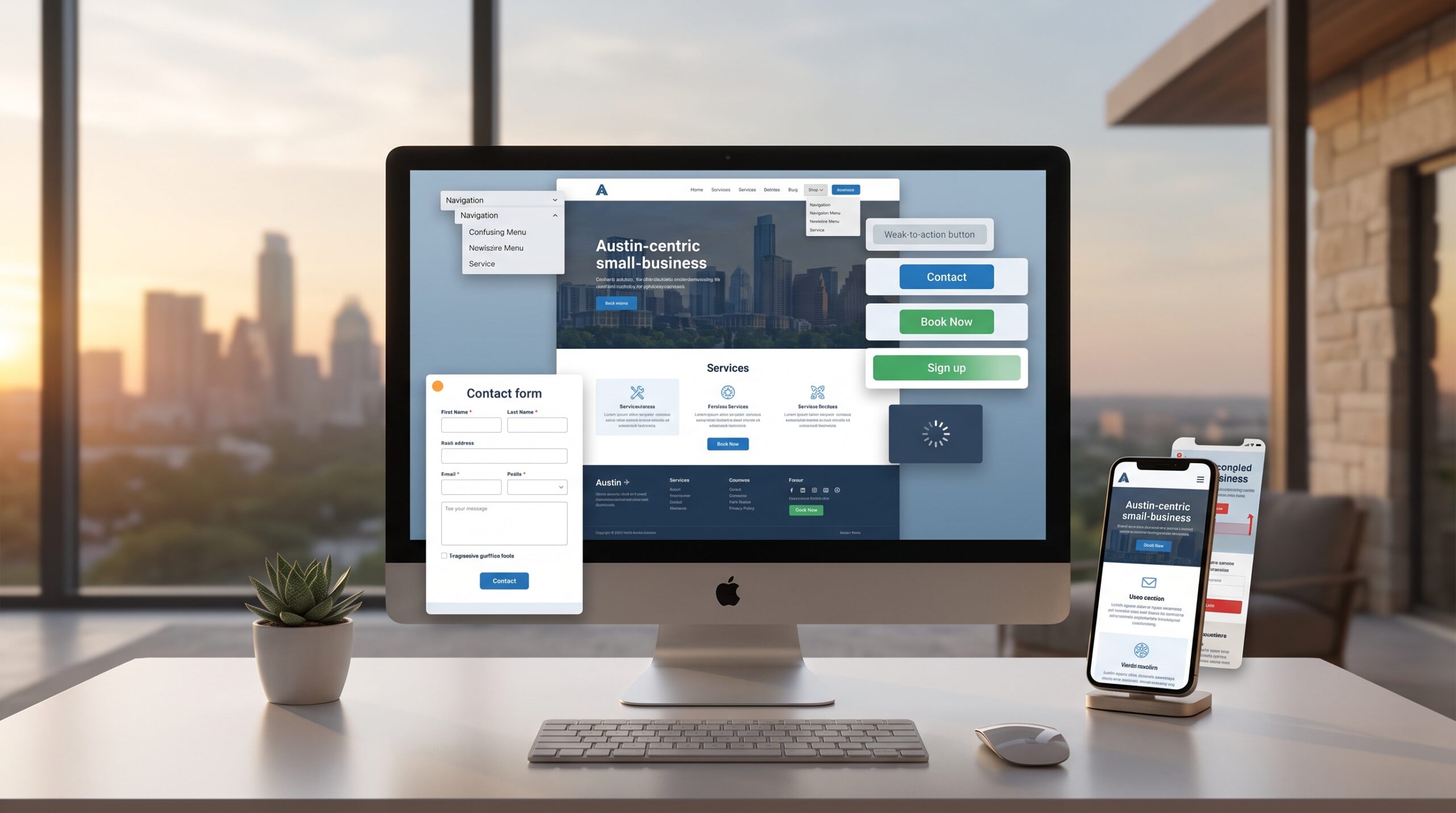
If a visitor has to pause and figure out where to click, you’ve already lost some of them. The most common navigation mistakes we see:
- Menu labels that are clever instead of clear (“Our Journey” instead of “About Us”).
- Too many top-level menu items, forcing visitors to guess which one has what they need.
- No obvious path from “I’m interested” to “I’m ready to contact you.”
Fix it: Use plain, expected labels. Keep the main menu to 5–7 items. Every page should have an obvious next step, whether that’s a phone number, a contact form, or a “Get a Quote” button.
2. A Call-to-Action That’s an Afterthought
A lot of Austin business sites treat the contact button like a formality — small, low-contrast, buried at the bottom of the page. If your call-to-action doesn’t stand out visually, most visitors will scroll right past it.
Fix it: Use a button color that contrasts with the rest of the page. Repeat your primary CTA at the top, middle, and bottom of longer pages. Say exactly what happens next (“Get a Free Quote” beats “Submit”).
3. Forms That Ask for Too Much, Too Soon
Every extra field on a form is a chance for someone to give up. We regularly see contact forms asking for a phone number, full address, and a detailed project description before someone has even decided if they trust you yet.
Fix it: Ask only for what you need to make first contact — usually name, email or phone, and a short message. Save the detailed intake questions for the actual conversation.
4. Slow Load Times That Kill Patience Before Design Even Matters
This isn’t strictly a UX design choice, but it behaves like one. If a page takes more than a few seconds to load, most visitors are gone before they see any of the design decisions you made.
Fix it: Compress images, avoid loading heavy scripts you don’t actually use, and test your site with Google’s PageSpeed Insights. This connects directly to how site speed impacts SEO as well — slow sites lose on both rankings and conversions.
5. Mobile Experiences That Feel Like an Afterthought
A site can be responsive — meaning it technically resizes — and still be a frustrating mobile experience. Common problems: buttons too small to tap accurately, text that requires zooming, and forms that are painful to fill out on a phone keyboard.
Fix it: Actually use your site on your own phone, regularly. Buttons should be easy to tap with a thumb. Forms should use appropriate input types (a phone keypad for phone number fields, for example). This matters even more given how much local search happens on mobile.
6. No Visual Hierarchy — Everything Fights for Attention
When every headline is the same size, every section has the same weight, and nothing is visually prioritized, visitors don’t know where to look first. The result is a page that feels busy without actually communicating anything clearly.
Fix it: Use size, weight, and spacing to guide the eye — one clear headline per section, supporting text that’s visibly secondary, and generous white space so key elements don’t compete with each other.
7. Trust Signals Buried or Missing Entirely
Visitors decide whether to trust a business within seconds. If your reviews, testimonials, certifications, or portfolio work are hard to find — or missing — you’re asking people to take a leap of faith they don’t need to take.
Fix it: Put testimonials or reviews near your calls-to-action, not just on a separate “Testimonials” page nobody visits. Show real project examples if you have them. Local businesses especially benefit from visible proof that other Austin customers trust them.
8. Inconsistent Design That Undermines Credibility
Mismatched fonts, inconsistent button styles, and colors that shift from page to page make a site feel unfinished — even if each individual page looks fine on its own. This is especially common on sites that have been updated piecemeal over several years.
Fix it: Define a consistent set of fonts, colors, and button styles, and apply them site-wide. Consistency reads as professionalism even when visitors can’t articulate why.
How to Know If Your Site Has These Problems
You don’t need expensive tools to start. Watch a few real people — ideally people unfamiliar with your business — try to complete a task on your site, like finding your phone number or filling out your contact form. Where they hesitate or get stuck is exactly where your UX has a problem.
FAQ
What’s the difference between UX and UI design? UI (user interface) is what a page looks like — colors, buttons, layout. UX (user experience) is how it works — whether visitors can actually accomplish what they came to do. A site can have great UI and still have poor UX.
How much do UX design mistakes actually cost a small business? It varies, but even small friction points compound. If a confusing form or hidden CTA causes even a modest percentage of visitors to leave without contacting you, that’s leads and revenue lost every single month, quietly, with no obvious cause.
Can I fix UX issues without a full website redesign? Often, yes. Many of the mistakes above — CTA visibility, form length, navigation labels — are targeted fixes, not full rebuilds. A UX audit can identify which issues are quick wins versus which point to a deeper redesign.
How do I know if my website needs a UX audit? If you’re getting traffic but few contacts or sales, that’s the clearest signal. Traffic without conversions usually points to a UX problem, not a marketing problem.
If your Austin business is getting visitors but not conversions, the issue is often UX, not traffic. See how our UX/UI design services can turn more of your existing visitors into leads.