Mobile use is not growing anymore. It has already taken over. Most people now browse, shop, and search from their phones. If your website does not work well on mobile, you are losing traffic, leads, and revenue.
For Austin businesses, this matters even more. The city has a strong tech scene and a mobile-first audience. People expect fast, smooth, and easy-to-use websites. That is where responsive web design becomes essential.
This article explains why mobile-first design matters, how it affects SEO, and what Austin businesses should focus on.
What Mobile First Web Design Means
Mobile-first design is simple. You start designing your website for mobile devices first, then adjust it for larger screens like tablets and desktops.
Instead of shrinking a desktop layout, you build from the smallest screen upward.
This approach fits modern user behavior. People are browsing on the go. They want quick answers, clear layouts, and fast-loading pages.
And if your site does not deliver that, they leave.
Why Mobile Traffic Dominates Today
More than half of all website traffic comes from mobile devices. In many local searches, that number is even higher.
Think about how people in Austin search:
- Looking for restaurants while driving
- Searching services during work breaks
- Comparing options on their phones
If your site is hard to use on mobile, users will not try to fix it. They will just move to a competitor.
That is why responsive web design is not optional anymore.
Google Uses Mobile First Indexing
Google now ranks websites based on their mobile version, not desktop.
This is called mobile-first indexing.
So if your mobile site:
- Loads slowly
- Has broken layouts
- Hides important content
Your rankings will drop.
Even if your desktop site looks perfect, it does not matter.
For businesses targeting web design Austin, this is critical. Local competition is strong. A small technical mistake can push you down in search results.
Better User Experience Means More Conversions
A good mobile experience directly affects how many leads you get.
Here is what happens on a poorly designed site:
- Buttons are too small
- Text is hard to read
- Pages take too long to load
- Forms are frustrating
Users leave within seconds.
Now compare that with a mobile-first design:
- Clean layout
- Easy navigation
- Fast loading
- Clear call-to-action
Users stay longer and are more likely to convert.
This is where responsive web design helps. It adapts your website to every screen size without breaking the layout.
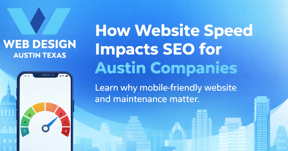
Faster Loading Speeds Improve Everything
Speed matters more on mobile than desktop.
People are often using slower connections. If your site takes more than 3 seconds to load, many users leave.
Mobile-first design focuses on speed from the start:
- Smaller images
- Optimized code
- Minimal scripts
This improves:
- SEO rankings
- User experience
- Conversion rates
Austin users expect fast websites. If your site feels slow, it reflects poorly on your business.
Local SEO Benefits for Austin Businesses
Mobile searches are often local searches.
People search things like:
- “best coffee shop near me”
- “plumber in Austin”
- “web design Austin services”
If your website is mobile-friendly, Google is more likely to rank you higher in these results.
Also, mobile users often take action quickly. They call, visit, or book services right away.
That means your website needs:
- Click-to-call buttons
- Easy contact forms
- Clear location details
A mobile-first approach supports all of this.
Consistent Experience Across Devices
Users may visit your website multiple times on different devices.
For example:
- First visit on mobile
- Later visit on laptop
If your site looks different or breaks on one device, it creates confusion.
Responsive web design ensures consistency:
- Same branding
- Same content
- Same experience
This builds trust.
And trust is what turns visitors into customers.
Design Simplicity Improves Clarity
Mobile screens are small. You cannot overload them with content.
That forces you to simplify your design.
And that is a good thing.
A clean layout helps users:
- Understand your message quickly
- Find what they need faster
- Take action without confusion
Many Austin businesses still use cluttered websites. This hurts their performance.
Mobile-first design removes unnecessary elements and focuses on what matters.
Competitive Advantage in Austin Market
Austin has a competitive business environment.
Many companies invest in marketing, SEO, and branding. But not all focus on mobile design properly.
This creates an opportunity.
If your website:
- Loads fast
- Looks clean
- Works smoothly on mobile
You already have an advantage.
Especially in service-based industries, users choose businesses based on how easy the website feels.
So improving your responsive web design can directly impact your growth.
Common Mistakes Businesses Make
Many websites claim to be mobile-friendly, but they are not.
Here are common issues:
- Desktop-first design squeezed into mobile
- Large images slowing down pages
- Popups blocking content
- Poor spacing and alignment
- Hidden important content
These problems hurt both SEO and user experience.
If you are serious about competing in web design Austin, you need to fix these.
Key Elements of Mobile First Design
If you want to improve your site, focus on these:
1. Responsive Layout
Your design should adjust automatically to different screen sizes.
2. Fast Loading Time
Optimize images, reduce scripts, and use caching.
3. Clear Navigation
Menus should be simple and easy to use.
4. Readable Text
Use proper font sizes and spacing.
5. Touch-Friendly Design
Buttons should be large enough for fingers.
6. Strong Call-to-Action
Make it easy for users to contact or buy.
These basics make a big difference.
How It Impacts Your Business Growth
A mobile-first website is not just about design. It affects your entire business.
It helps you:
- Rank higher on Google
- Keep users engaged
- Increase conversions
- Build trust with customers
Ignoring mobile design means losing opportunities daily.
Austin businesses that invest in responsive web design see better results over time.
Final Thoughts
Mobile-first design is no longer optional. It is the standard.
If your website is not built for mobile users, you are already behind.
And in a fast-moving market like Austin, that gap grows quickly.
Start by reviewing your current website:
- Is it fast on mobile?
- Is it easy to use?
- Does it guide users clearly?
If not, it is time to improve.
A strong responsive web design approach will help you stay competitive, attract more users, and convert them into customers.
And that is what really matters.